The graph is wrong.
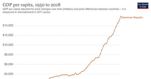
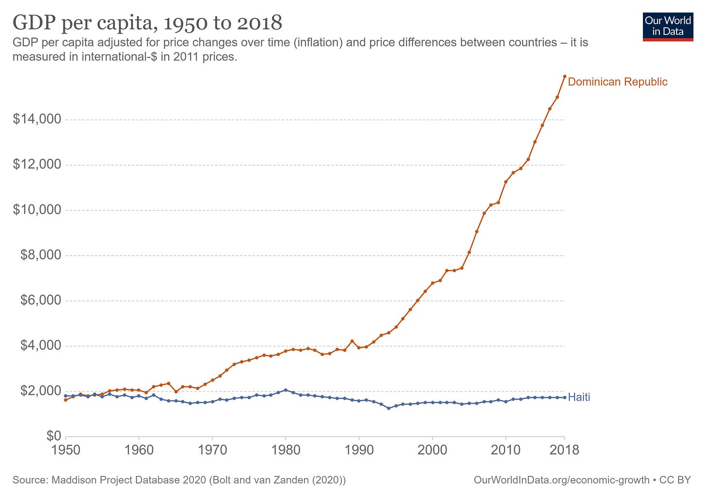
It’s about a week after the assassination of Haiti’s President, Jovenel Moïse, and a graph is going viral. The virality is understandable because the graph defies conventional wisdom. Somehow, Haiti was richer than the Dominican Republic as recently as the 1950s.
Except, the graph is wrong. I know it, and it’s driving me crazy.
The virality began with Noah Smith. First with this tweet (4k+ likes, 1k RTs/QTs), then with this post. Here’s the graph.
If you only know one thing about Haiti, you know it is poor. You might not know it is the poorest country in the Americas (well, at least until Venezuela stole the title recently). But you know it’s poor and has been for a long time.
But this graph pushes back on the idea. Maybe poverty isn’t as old as we thought. It forces us to imagine a counterfactual Haiti. Maybe there’s a world where Haiti made a few decisions and looks like the Dominican Republic today.
If only the graph was right.
I’m going crazy because even though I know the graph is wrong, I don’t have direct evidence to refute it. I have other sources that show divergence began earlier, and I have hard-earned wisdom from graduate school. Starting with these two, I embarked on my journey to show the graph was wrong. Two months later, I can confidently say the graph is absolutely wrong.
(Note: even though I know Noah was not the one who created the graph, if you want to refer to this essay as “the brutal takedown of Noah’s Haiti take” when you share it, it would help this get attention.)
Sweet Alternative Evidence
Look, I don’t want to flex here, but I have a PhD in economics. And my dissertation focused on the economic history of Haiti. And just when I thought no one cared about that research, along comes this viral graph. From that paper (now published open-access in the Journal of Economic History) I have one graph that easily casts doubts on this idea that Haiti and the Dominican Republic didn’t begin to diverge until the 1960s. So if there is any time to flex, it’s right now.
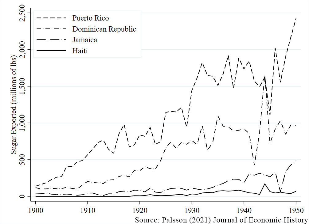
The graph from my dissertation:
This graph shows that Haiti, once the global leader in sugar production, was far behind its Caribbean neighbors in the 20th century, and very behind the Dominican Republic. Instead of sugar, Haiti is producing coffee. But sugar was generating more revenue. If Haiti had produced the same amount of sugar as the Dominican Republic in 1949 (one year before the viral graph starts), then its export revenues would have increased by 130%.
There are a lot of reasons that direct comparison might not be convincing. But consider labor flows. Sugar production in the DR was so profitable that every year approximately 100,000 Haitians would travel to the DR to work on sugar plantations to earn wages about 2-3x what they could get in Haiti. Many even settled in the DR! (That is, until President Trujillo massacred thousands of Haitians, which is a story for another post.) The people knew there was a divergence as early as the 1920s.
As much as I’d like to say my paper has the final word, we can also quote Victor Bulmer-Thomas, from The Economic History of the Caribbean Since the Napoleonic Wars, on all the evidence that Haitian divergence began much earlier than the 1960s:
Yet Haiti did fall behind and by 1910 was lagging all the Americas — not just the Caribbean…Haiti by this time — only two decades after 1890, when its performance was still satisfactory — had the lowest foreign trade per head, the lowest budget figures, the smallest infrastructure per head and one of the highest rates of per capita indebtedness….The comparison with the Dominican Republic was particularly galling for the Haitians. As late as 1880, Haiti had outperformed its neighbour on all counts. furthermore, the Dominican government had defaulted on its first foreign loan in1874, but Haiti had punctually serviced her external debts. Yet, thirty years later, it was the other way around….We can therefore state with some accuracy that it was between 1890 and 1910 that Haiti fell behind. (pp. 187-189, emphasis added).
Clearly the divergence began before the 1960s. So why do the data say otherwise?
Unhappy Maddison Productions
If I’m right, then there must be something wrong with the data. Where do the data come from? If you check that note at the bottom of the graph, it says Maddison Project Database.
And that about explains everything you need to know.
…
Not making sense yet?
Well, during my graduate school years (did I mention I have a PhD?), I was raised by goodly advisors. One of the first pieces of advice they gave me was, “Never trust the Maddison data.”
As soon as I saw that source, I knew I had to investigate where the data came from.
Digging around, I found Maddison’s 2001 explanation of the data sources. Appendix A-2 says the data for Haiti and the DR came from Series Históricas del Crecimiento de America Latina. Going through every other Maddison Project publication I could find, I never discovered an updated data source for these two countries. As far as I can tell, the data never change across releases.
Which creates a puzzle. The divergence between Haiti and the DR is not consistent across releases. In fact, it is only in the most recent release that Haiti stays richer than the DR through the 1950s. If the data haven’t changed, then why does the gap shift?
From what I can tell, it has to deal with converting the raw data into constant 2011 dollars. This conversion has to account for inflation and purchasing power across countries. It’s a tough business! And, according to the Maddison Project, it’s even tougher in Latin America.
“Providing new estimates of income levels in Latin America has proven to be a particular challenge as the combination of relative price benchmarks with current National Accounts data often leads to notably lower income levels with especially implausible implications over the long run.” Rebasing "Maddison": New Income Comparisons and the Shape of Long-Run Economic Development p. 44
When the estimates are too low to be plausible, the Maddison Project adjusts the data to be more believable. And in that same report, it mentions that Haiti was too low to be plausible in 1960. So, they just adjusted it to look better.
Holy crap!
Did you catch that?
Haiti and the Dominican Republic look the same in the 1950s because the data collectors assumed they were the same! It has nothing to do with the original data.
As my advisors said, “Never trust the Maddison data.”
The OG Data
Are there any data we can trust? Well, why don’t we use the original data?
Through the miracle of the internet, I can look directly at the source, Series Históricas del Crecimiento de America Latina. The report uses real data reported by the countries, so we can trust it to an extent.
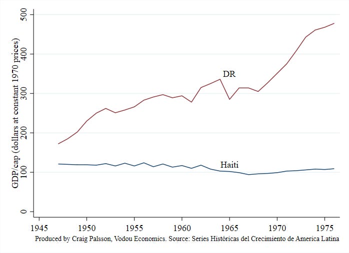
Maddison merged the raw data with later decades then converted everything to constant dollars. But, amazingly, the report already has a section that converts the GDP data into constant 1970 dollars. What do the comparisons look like in the original data?
As expected, Haiti was always poorer than the DR during this period. While every Maddison release says Haiti was richer than the DR in 1950, the source data says the DR was already twice as rich ($230/cap compared to Haiti’s $119).
Yes, the gap widens through this period, especially through the 1970s. But according to the source data (and multiple other sources) Haitian divergence began long before this period.
Who cares?
At first glance, this seems like a pedantic rant. Especially because the gap is still widening in the 60s and 70s. Isn’t the main point that something happened in those decades that we should care about?
We absolutely should investigate those decades more. But pinning down divergence helps with the hypotheses for that divide. For example, Noah inspects several hypotheses, and the first one is Haiti’s large (and unjust) debt to France. Here’s part of his dismissal:
But there are some big problems with this thesis. First of all, Haiti finished paying back this debt (which France reduced) in 1947. That’s at least a decade before Haiti and the D.R. started to diverge economically, and four decades before the divergence became pronounced.
Now that we know Haiti diverged about half a century before the Maddison data claims, that puts this hypothesis back in the game. (I have my own hot take on the debt-poverty hypothesis, but that will have to come in the future.)
Most importantly, it shows how tough economic history is. These comparisons are hard, but the questions are super important. If we want to understand them, we need to approach them with deeper work.
If you’re someone hoping to work on Haiti’s economic history, let me know!


Please use color in addition to the dashes in your graph. Maybe then it’ll go viral
A reply to ‘Don't Believe the Haiti/DR Graph’, by the ‘total morons’ of the Maddison Project
Craig Palsson discusses a graph, based on the dataset made by Maddison and the Maddison Project (MPD), which shows the dramatic divergence between Dominican Republic and Haiti since the early 1950s. His main point is that ‘the graph is wrong’ because it shows that in the early 1950s Haiti was more or less at par with the Dominican Republic, or perhaps even slightly richer, which in his view is impossible, given what he knows about the two economies at the time. He concludes to ‘never trust the Maddison data’.
The Maddison Project does two things: first it collects, reviews, and standardizes time series of real GDP and population of almost all countries in the world - some of which go back in time to the Middle Ages. Second, the project it aims to make these series comparable over time and space, using purchasing power parities (PPPs) benchmarks from the World Bank / ICP (most recent available years are 2005, 2011 and 2017).
When comparing the series for Haiti and the Dominican Republic included in the Maddison Project database to the data Graig Palsson shows from Series históricas del crecimiento de América Latina (CEPAL, 1978), it is clear that there is a large degree of consensus about the trends of GDP per capita in the Dominican Republic and Haiti as the growth rates from both databases are very similar (see graph: https://www.rug.nl/ggdc/blog/maddison-project-re-don-t-believe-the-haiti-dr-graph).
As a result, both databases show that whatever the income gap in 1950, it has increased substantially since then. This does not come as a surprise since Maddison made use of the CEPAL data for these two countries. So far, so good, and no reason to distrust our data.
Where both databases differ is in the choice of the PPP benchmark used to convert the income series into a single currency in order to make the comparison between the countries over time. Maddison preferred his own 1990 benchmark, which shows a DR/H ratio of 2.45/1 in 1990; this may have been an underestimate, as Craig suggests (as it leads to in his view unplausible MPD results for the 1950s). The CEPAL uses a 1970 benchmark, which gives a ratio of 4.3. The DR/H ratio according to the 2011 ICP study was 7 (which is consistent with the 2.45 for 1990) and for 2017 it is 10 (but this benchmark was not yet available to us when putting together the 2020 update; both countries did not participate in the 2005 ICP round).
Selecting which benchmark to use is a complex issue as all benchmarks have their pros and cons and contain certain margins of error. We have analyzed this in detail in our 2020 paper, where we decided to use the 1990 benchmark for the extension of series back in time, resulting in estimates which, if Craig is correct, are unsatisfactory for the DR-H comparison for the 1950s. The underlying problem is the inconsistency of time series estimates of GDP growth and benchmark studies estimating relative levels of GDP per capita for a specific year. Due to changes in relative prices and budget shares as well as due to measurement errors, successive benchmarks and the time series that link them, never fit exactly. More interesting is to analyze the underlying patterns: some countries do not grow rapidly, but still become extremely rich (at the next ICP benchmark) – some oil producing countries which experienced rapid prices increases are cases in point – whereas other countries do grow a lot but do not achieve a comparable rise in GDP per capita (at the next ICP benchmark), probably because of unfavorable changes in relative prices.
Such biases may also help to explain why ‘the graph is wrong’, because the growth paths of the two countries were so different. The strategy to cope with this problem is to create independent benchmark estimates for historical periods, to test the accuracy of the GDP pc gaps that is projected back in time. In our 2020 paper we have collected the available independent benchmarks and where necessary, adapted the GDP estimates accordingly. This is also what we would like to suggest to Craig: the building blocks for an independent estimate of the relative level of GDP per capita in the 1950s are available, so let’s improve the quality of the Maddison dataset by adding such a benchmark DR/H to it. The strategy Maddison masterminded over the years, and that the project and these two morons have further developed, aims at adding new estimates – better time series, new benchmark studies – to gradually improve the quality and extend the scope of this kind of work. So that, at a distant point in the future, even goodly PhD advisors will say ‘Do trust the Maddison data’.
P.S. It would have been more constructive if Craig would have asked for our comments before putting this blog online. At one point he simply misunderstands what we have done and accuses us of adjusting the estimates for Haiti ‘to look better’ (and even concludes: ‘Holy Crap! H and DR look the same in the 1950s because the data collectors assumed they were the same’). This borders on questioning our scientific integrity – or even goes beyond it. That is not how academics – or indeed humans - should interact; academic exchanges – assuming that this is what we try to do – have other rules of the game than those of Twitter or Facebook.
We of course did not do such a thing (that is, change numbers to make them look better). We compared different methods to extrapolate time series back in time and studied the consequences of the various alternatives (no harm done, we think). One of the criteria for assessing the quality of the resulting estimates was to see how many backward ‘predictions’ resulted in levels of GDP per capita which were below subsistence (as it is the assumption that most societies in most times manage to feed and cloth their populations). So, we did not alter the estimates. Instead we selected a method for backward projection that resulted in the most plausible results given the underlying data.
Jutta Bolt and Jan Luiten van Zanden (did we mention that we both have a PhD?)
Maddison Project Database, version 2020. Bolt, Jutta and Jan Luiten van Zanden (2020), Maddison style estimates of the evolution of the world economy. A new 2020 update, Maddison-Project Working Paper WP-15
Bolt, J. and J.L. van Zanden (2021). The long view on economic growth: New estimates of GDP, in M. Mira, A. Rijpma and J.L. van Zanden. How Was Life Volume II, New Perspectives on Well-being and Global Inequality since 1820, second edition Paris: OECD (pp. 29-52).
Inklaar, R., R. Marapin, P. J. Woltjer and M.P. Timmer (2021). Inconsistencies in comparing relative prices overtime: patterns and facts, GGDC research memorandum 189.